15 Maps That Will Change How You See The World
There once was a time not so long ago when you couldn't go anywhere without a thick foldable map from an unassuming gas station or a lengthy set of printed Mapquest directions. But even now that we're deep in the golden age of Google Maps and GPS, there's still plenty to love about a quality map. After all, the classics never go out of style.
There are the artfully rendered pieces of historical cartography that give us a vista into the past, but then there are those maps that tell us more about our world than we ever thought possible. From maps that reveal the vast secrets hidden just beneath the ocean's surface to those maps that tell us a story of just how closely the human race is connected, a good map can be a source of insight, reflection, and even introspection. A few of the most fascinating maps may even lead us to some of our best adventures yet.
An interactive map of shipwrecks around Ireland
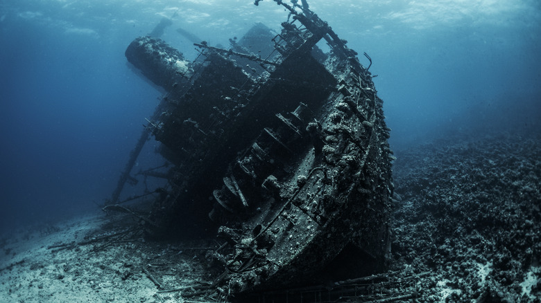
It is a little bit niche, we don't deny that, but few things drive home just how risky an endeavor boat travel was historically like a map of the shipwrecks surrounding Ireland. For centuries, sailing was the only way to cross the ocean, making it hard to avoid for anyone looking to explore, conduct trade, or engage in international relations. Through the millennia, Ireland's key location as a gateway between northern and southern sea routes, thousands of miles of rocky coastline and massive reef systems, and tendency to generate powerful Atlantic storms have transformed the wild coastal routes surrounding the Emerald Isle into a serious ocean graveyard. Today, it is estimated to contain more than 18,000 ships, according to the country's Underwater Archaeology Unit (UAU) program.
The country's Wreck Inventory of Ireland Database (WIID) maintains a comprehensive record of both potential and known shipwreck sites around the island's waters. You can check out the known shipwrecks in the collection through the interactive National Monuments Service Wreck Viewer map. The map shows wrecks from throughout Ireland's history and even includes prehistoric logboat wrecks that can be found in the inland waterways. The vast majority of these wrecks date from the 18th century onwards, with more than 1,800 shipwrecks related to World Wars I and II.
A map of the observable universe

Astronomer, astrophysicist, and cosmologist Carl Sagan called Earth a "pale blue dot," emphasizing that the only home we've ever known is truly just a single point in the unfathomably vast universe we live in. Spend some time truly perusing a map of the stars, and you're likely to come out with a much greater appreciation for how much all of humanity has in common. Graphic designer and technologist Nikita Shtarkman and Johns Hopkins University Department of Physics and Astronomy faculty member Brice Ménard worked together with Sloan Digital Sky Survey (SDSS) and Johns Hopkins University to create an interactive map of the known universe that may truly reframe your sense of your place in the world.
Ménard and Shtarkman based their map on data compiled over a 15-year period from a telescope in New Mexico, a state with some of the most pristine dark sky stargazing locales in the United States. Earth sits at the bottom of this map opposite the edge of our observable universe, beneath the stunning 200,000 or so galaxies. It's a perfect place to pick up some sense of the Overview Effect — the cognitive paradigm shift that profoundly changes the way astronauts see the world, inspiring a sense that humanity is one great brotherhood.
Language families around the world
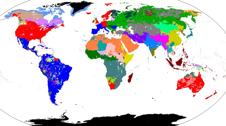
Our shared home isn't the only thing every member of the human race has in common. There's also arguably our greatest evolution — the capacity for humans to communicate concepts both concrete and incredibly abstract through language. It's one of our most fascinating traits as a species, and as this detailed map of human language families demonstrates, our languages have evolved vastly over time.
This detailed human language families map from Wikipedia looks at just how many language families exist around the world, and you might be surprised to find just how many language groups you've never even heard of or even which language family a language belongs to. Note, for example, that the English-speaking regions of Australia, the United States, and England are colored red for Germanic, which is nested under the Indo-European language family, alongside a long list of language families such as Romance, Celtic, and Slavic. You'll likely also find quite a few language families you've never heard of, the kind of languages that can't be studied on Duolingo. It's yet another reminder of how truly small we all are in the grand scheme of things.
A 16th century world map
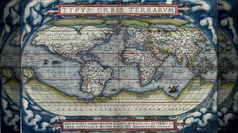
In our modern world, where just about everyone you know has a tiny, powerful computer connected to a vast library in their pocket at all times, one might be forgiven for thinking we've evolved to know all there is to know about the world we live in. But just one look at a map from only a few hundred years ago can be a humbling reminder that the human race has a very long track record of thinking we know much more than we do. Such is the case with the Theatrum Orbis Terrarum ("Theatre of the Lands of the World") map, a world map considered by many to be the world's first modern atlas.
Developed by Flemish geographer Abraham Ortelius and published in Latin in 1570, the beautifully designed map-book is now housed in the Library of Congress Geography and Maps Division's extensive map collection. For his time, Ortelius was no slouch. On the contrary, he was one of the 16th century's most gifted cartographers, creating his maps from a vast catalogue of sources, including some that no longer exist. Although Ortelius' maps will appear imprecise to the modern eye, they were highly authoritative for their time. The Theatrum was also astonishingly popular for a Renaissance map book, selling around 7,300 copies in 31 editions and seven languages.
A map of humanity's impact on the environment
In our interconnected system, where individual actions can seem to have little impact on the grand scheme of things, it can be easy to breeze through life without thinking too hard about humanity's effect on the world around us. If you're open to taking in a reality check, spend some time interacting with the Global Footprint Network's biocapacity impact map, which measures a number of factors pertaining to an ecosystem's capacity for regenerating resources while absorbing human-created waste materials. Nations that emit more waste than their ecosystem can absorb or exceed their local ecosystem's ability to produce more through imports and exports have what's known as an ecological deficit, while those with a lower impact have a reserve.
The interactive map allows users to explore a region's footprint per person, total ecological footprint, biocapacity per person, total biocapacity, and ecological deficit or ecological reserve. Clicking on any country will yield more specific data, including details such as GDP per person and biocapacity data changes through the years. Underneath the map, you'll find lists of the highest reserve and deficit countries around the globe.
A map of human migration
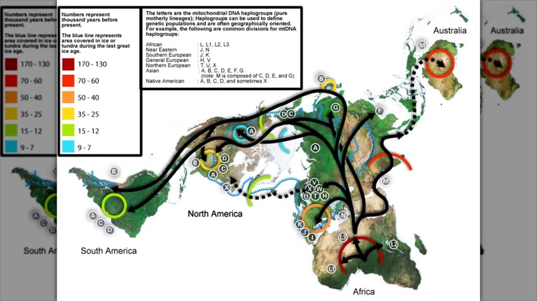
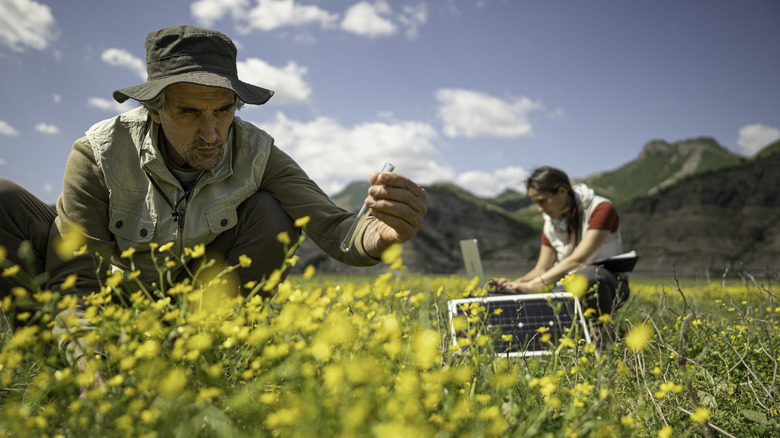
Since nobody was writing books or recording TikToks about the story of prehistoric human migration as it was happening, we have to rely on science to help us piece it together. A key piece of that science is population genetics — that is, studying how human genetics have changed over time and what that has to say about the story of where humans have moved through the millennia. Taking a look at how that story unfolds on a genetic map of human migration shows how much we all truly have in common and serves as a reminder that we are all part of one big family as a human race.
The map follows mitochondrial DNA haplogroup migrations, color-coded by 1,000-year periods. In doing so, it tells the story of humanity's migration out of Africa, through Europe, the Americas, Australia, and beyond. It's almost hard to believe we can learn so much from a little DNA.
An interactive map of global disasters
Most of us have had those days where we turned on the news and it felt like the world was on fire, but disasters have been a part of life on Earth since the dawn of time. The world is a big place, and there's always something going on somewhere. In the modern world, you can stay on top of every earthquake, volcano, tornado, and tsunami with an interactive map of global events that covers the whole enchilada.
This comprehensive map, presented by the Hungarian National Association of Radio Distress-Signalling and Infocommunications (RSOE) and the Emergency and Disaster Information Service (EDIS), covers a wide range of major global events, from hurricanes to food poisoning outbreaks, using data compiled from a range of organizations, media sources, and authorities. Click on any individual icon to learn more about each event, including news item specifics and mortality numbers. Users can also zoom in and out or filter disaster types using a key on the right side of the map.
A Tyrannosaurus distribution map for dino lovers
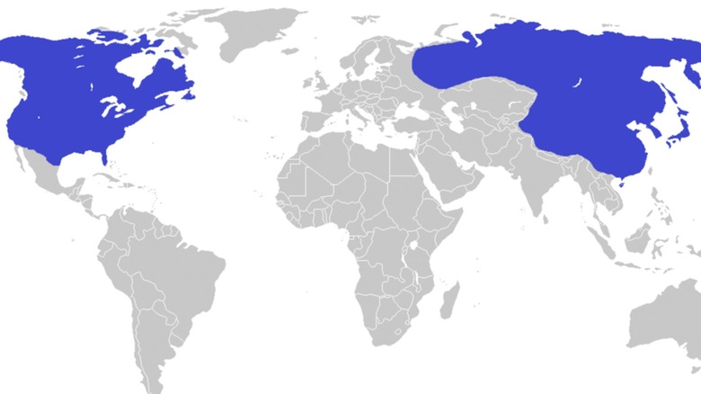
For creatures with tiny forearms and even tinier brains, the great and mighty Tyrannosaurus certainly left its mark on the planet during its short (well, anywhere between 1.2 and 3.6 million years) run. And if you've ever wondered whether history's most famous dinosaur might have once roamed around your very own front yard, now you can find out with Wikipedia's Tyrannosaurus distribution map that shows exactly where the massive bipedal dinos hung out.
The map — which uses blue to denote where Tyrannosaurus hung out — shows the species mostly stretched out its living quarters across Asia and North America. And if you're looking for a little more up-close-and-personal dinosaur action when you're through checking out the map, you can always visit North America's dinosaur hotspots like Utah's thrilling "Dinosaurland" or Glen Rose, the Dinosaur Capital of Texas, where you can walk in the very footsteps where real dinosaurs once walked millions of years ago.
Map of the easiest moon features you can see from Earth
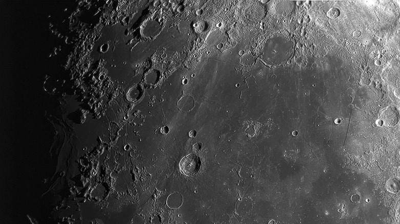
If you'd rather be looking to the sky above than the earth below, take a good look at the Planetary Society's map of the easiest moon features you can see from our planet. Part of the Bruce Murray Space Image Library, a collection of mostly public domain images compiled from amateur and global space agency images, the map presents an image of our moon overlaid with moon feature outlines and labels, with maps available for both the Northern and Southern hemispheres.
For anyone interested in moongazing, this map is a necessary download. What appears to the naked eye as shadows or dark spots suddenly comes alive in the form of real locations like the Tycho Crater, Mare Tranquillitatis (Sea of Tranquility), and Oceanus Procellarum (Ocean of Storms). You can even download and print a copy to take with you on your next nighttime stargazing adventure in one of America's best state parks.
A map of the Underground Railroad
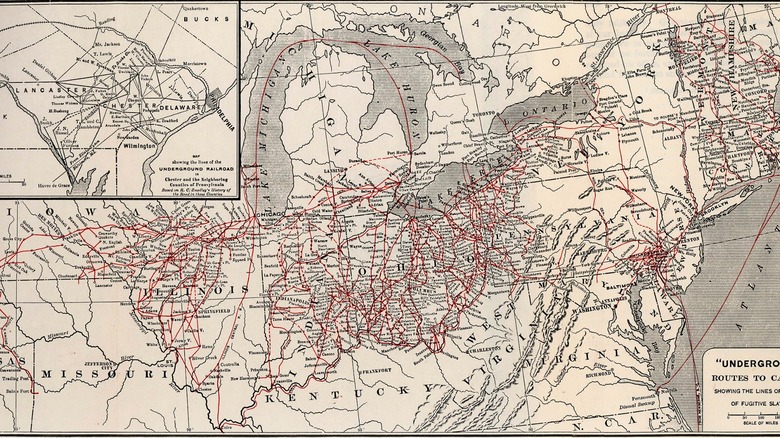
If a less-than-comprehensive secondary education left you with a vague understanding of just how extensive the Underground Railroad was, you will likely find this map of the entire network of escape routes and safe houses for ushering enslaved people to safety fascinating. Far more than just a few main routes, the Underground Railroad was a complex network spanning the United States. It was an incredible undertaking.
The map — excerpted from Wilbur H. Siebert's 1898 book "The Underground Railroad from Slavery to Freedom" — shows routes across the country, extending as far west as Nebraska and Kansas, and as far north as the Great Lakes and into Canada. Although not incredibly detailed, the map gives a sense of the difficult terrain fugitives would have had to travel, bringing to life the sense of peril they would have experienced on that journey to freedom. At the same time, it gives a picture of how many people were working together to help bring others to freedom.
A U.S. animal migration map

The United States is home to some spectacular annual animal migrations, from the flocks of starlings seen lining power lines each fall to the stunning late-summer monarch butterfly migration. And you can learn about some of the country's most epic animal migrations from the U.S. National Park System's migration map, which details the epic migratory journey of eight species, namely the Arctic tern, humpback whale, loggerhead sea turtle, monarch butterfly, osprey, pronghorn, rough-legged crane, and sandhill hawk.
This color-coded map gives a true sense of how epic some of these creatures' migrations truly are. For example, the Arctic tern clocks in a whopping 25,000 miles as they travel back and forth from the Arctic Ocean to Antarctica each year. The map also gives an idea of the best U.S. destinations to catch whales and other migratory animals along their journeys. Consider yourself a traveler? These animals put in some serious miles.
A map showing where gold and diamonds can be mined
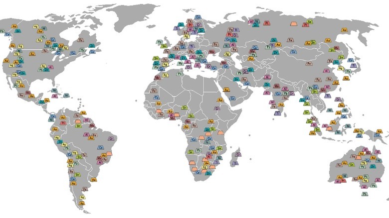
Even if the Gold Rush days of the 19th century are long over, it's still pretty interesting to learn how many gold deposits there are all over the world. This simplified world mining map helps you do just that. This relatively straightforward global map uses color-coded elemental icons to show locations of mineral deposits, including sparkly jewelry store favorites like diamonds, gold, silver, titanium, and platinum. For example, gold deposits are found in a few areas across the western United States, while copper deposits can be found throughout the southwest.
However, it's not just the fun ores you'll find on this handy little would-be miner's guide (available on Wikipedia). The map also presents potential locations for crucial deposits like nickel, tin, manganese, and chromium. The author advises that mineral recovery is presently the best tool for harvesting many ores, due to labor savings and reduced environmental impact.
A map of the Great Pacific Garbage Patch
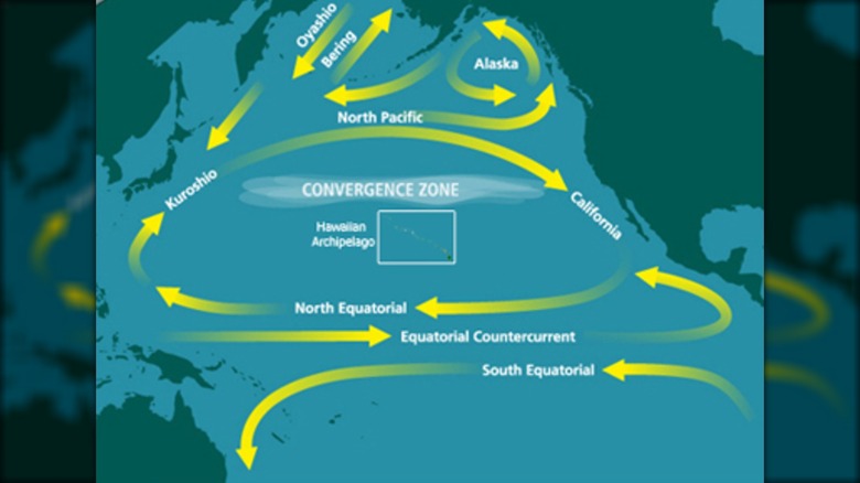
Floating somewhere in the ocean between California and Hawaii is a massive floating patch of mostly plastic garbage, much of it broken down into confetti-sized pieces, known as the Great Pacific Garbage Patch. While it's less of an obvious floating trash pile than a vast stretch of bobbing microplastic debris soup, it's still pretty gross — not to mention terrible for the ocean creatures forced to cohabitate with it. And now you can follow its migratory path around the Pacific with a map of its route on Wikipedia, which follows the gyre of the North Pacific Subtropical Convergence Zone.
The map shows the garbage patch's travels from the South Pacific to the North Pacific around the Hawaiian archipelago. Even if it doesn't make you want to think about using fewer plastic products, it might make you reconsider eating fish caught in the Pacific if you're not into consuming secondhand microplastics.
A map of the Rubber Ducky migration
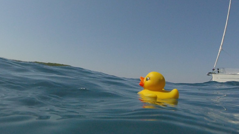
On January 10, 1992, just south of Alaska's remote Aleutian Islands in the subarctic front of the Pacific Ocean, a shipping vessel called the Evergreen Ever Laurel hit stormy waters and lost two columns of shipping containers stacked six high to the cold, murky waters of the North Pacific. And when they fell, a large contingent of First Years Floatees infant bath toys came bobbing to the surface, package and all. Eventually, the ocean worked its magic on those packages, leaving nothing but the Floatees themselves: a vast collection of green frogs, blue turtles, red beavers, and yellow rubber duckies — a total of 28,800 of the little three-inch bathtime toys.
Over the past 30-some-odd years, they've been floating around the globe riding the ocean's currents, washing up on shores from time to time. You can follow their journey on this map from the United Kingdom's Royal Meteorological Society.
A 19th-century map of time depicting the whole of human existence
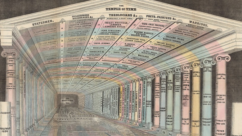
Way back in the 19th century, Emma Willard was one of those brilliant, plucky women who passionately believed in promoting women's higher education to the point that she even founded her own school. She was also known for something else: Creating beautiful and informative graphics, maps, and atlases that were way ahead of their time. Many of these were presented in Willard's 1823 book "Woodbridge and Willard Universal Geography."
Far beyond mere maps, Willard had a gift for presenting complex ideas in infographic format. Willard did this brilliantly in her 1836 work "Picture of Nations; or Perspective Sketch of the Course of Empire," outlining major human events, such as the birth of Jesus Christ, and various epochs in human history. In much the same vein, Willard's "Temple of Time" presents a temporal map of recorded history depicted in architectural columns and swirling details, all reflective of the author's 19th-century worldview.